Wireframes are always a fun part of the design process. It’s the stage where you get to see all the interactions that are needed in order for an app or a website to work well. The best way to make wireframes is to use the tool that you don’t have to think much about to use. For this reason I love using Adobe Illustrator whenever creating wireframes, and these are some my tips, tricks, and example of how I use Illustrator to get ideas on “paper”.
Pros of using Adobe Illustrator
- You only need to know a couple things in order to be able to use the program well.
- It’s parametric, so every dimension can be set using a numerical value.
- It’s a big data program, so you can have parts of a wirframe that you need outside of the artboard.
- No one ever complains about receiving a vector file.
Cons of using Illustrator
- The community isn’t as large for free assets, so often you have to create them, or spend a couple bucks if you don’t have to time to make them yourself.
- There isn’t a great way to share your ideals and have your clients give feedback (Work around to come in a feature blog post).
- If you have to export objects for development, its anti aliasing can look poor.
Remember, use the tool that allows you to focus on the end result, and doesn’t require much cognitive energy to use. After all, the point is to get thoughts lied out, not spend time wondering where the various tools are. With that in mind, lets dive in to some quick tips for using the program.
Use the appearance panel whenever possible
I use this the most when creating objects with rounded corners or shadows. Under the fx button in the appearance panel is where all the goodies are. Play around with them and see what works well for what you need to do.
Example: in the past when I wanted to create a rounded rectangle for a button, I would go straight for the rounded rectangle tool. Occasionally I would run into the problem of that objects radius distorting whenever I changed its size. Eventually I learned that if I use the “create rounded rectangle” in the (fx) of the appearance panel, I could scale to my hearts content. Because its a function applied to a rectangle, if scaled, the radius is applied to the new object. As a bonus, you can go back at any time and adjust the radius of the rectangle at any time.
Align objects with the alignment panel, not by sight.
I’ve inherited some sketchy documents in my day, where the designer copied an object, and eye-balled where objects would go. Rather then guessing, just use the alignment panel. All you need to do is hold ctrl, select all the element you would like to align, then click once on the element you would like to align to. Then apply the appropriate alignment (right | left | center) in the alignment panel. Now all the selected objects are aligned.
Lock objects to help make selecting objects easier.
Using ctrl+2 to lock objects comes in useful when you have a things like form fields. Rather then go through and click on every object that needs selected, you can drag and select all the objects to lock (usually for fields are sticking out further then the text describing the form). Once the select fields are locked, you can drag and select all of the text. Alternatively, you can also hide objects..
Quick keys to use:
Lock
Unlock
Hide
Un-hide
Group objects as little as possible.
Working in Illustrator quickly means that you need to have the ability to quickly select objects. Ideally by only clicking once to select the one you want, so use grouping sparingly.
Quick keys to use:
Group
Un-group
Use Artboards
Artboards makes Illustrator great for fast iterations. Once you have one artboard/screen view created, you can drag out another artboard to make a copy with all the elements in place.
Quick keys to use:
Artboard
Learn to cut and paste
Whenever moving objects from one artboard to another, use copy paste whenever possible.
When coping make sure you are on the artboard you would like to copy from. The black border around the artboard that if selected is slightly thicker then that of the others is the indicator that you’re on the right artboard. Just to be safe, all you need to do is click in the artboard area to select that artboard. Then copy (ctrl+c), click once on the artbaord that you would like to past onto, and past in front (ctrl+f). Pasting in front or back applies to whatever is selected. e.g. if you have some text that you’d like to idicate that it’s scrolling behind the bottom nav. All you need to do is move the text to where it should go. ctrl+x, select the bottom nav box, ctrl+b and now it’s behind the bottom navigation.
Quick keys to use:
Cut
Copy
Paste in front
Paste in back
Here is a quick walk-through of my process for creating a wireframe:
To kick off a project it’s always a good idea to read the human interface guidelines for the devise that you are designing for.
For this example I will be designing for the iPhone 5, you can find the human interface guidelines for this device at this link.
After reading the guidelines, open up Adobe Illustrator and set the artboard size to the dimensions of the device.
Once you enter the right dimensions for the artboard, using the rectangle tool; draw out the header, bottom navigation bar, and any other elements that will be repeated throughout the wireframes. Note: the iPhone 5 has a pixel density that is twice the amount of what the HIG suggests, so I’m going to draw out my shapes at twice the recommend size so that the scale is appropriate.
Holding Alt and dragging a shape will make a duplicate. This is a great way to get all the primitive shapes needed quickly created. For objects that require even spacing like form fields, this becomes even more useful. After dragging out a copy, type Ctrl+D which will duplicate the action that you just performed.
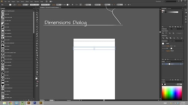
If you need to change the size of any shape at any point, it’s a good idea to use the dimensions box in the upper right of Illustrators top panel.
After any shapes that will remain the same throughout the wireframe have been created, open up the symbols pallet, and drop them in there. A dialog box will pop up allowing you to name the symbol appropriately. This box has some additional options, but unless you’re working in Adobe Flash, you can just ignore them.
Once the objects have been created, it’s just a matter of moving around shapes that, adding some text, and getting your ideas out there. The less you have to think about the tool you’re using, the more you can focus on the end goal i.e. making your product better.
Bonus Goodies:
Cut
Copy
Paste in front
Paste in back
Check Spelling
Group
Ungroup
Triangle Mar-key Tool
Duplicate last action
Lock selecting
Unlock all objects
Un-hide all objects
Zoom in and out
Switch to artboard mode


0 Comments