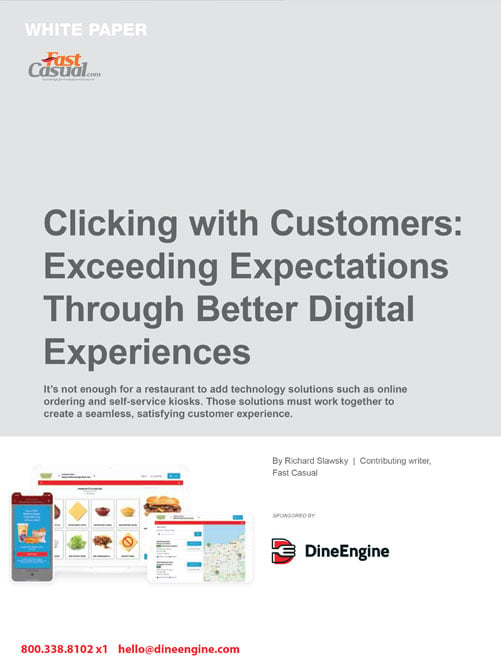
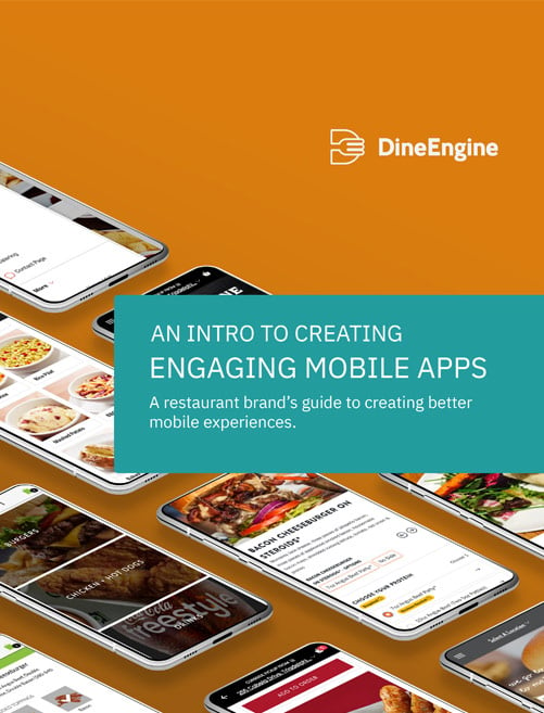
Smart online ordering design tips can make or break a web or mobile site.
Offering the ability for customers to order online can help increase sales, but how those sites are designed can have a major impact on their effectiveness.
There’s no doubt that online commerce is changing the way consumers do business.
Although online ordering design tips can be leveraged as a growth opportunity for restaurant operators seeking to grow their businesses, simply deploying a generic ordering solution isn’t enough.
The look of a restaurant’s online ordering site reflects the professionalism of the brand. If the site isn’t visually pleasing and easy to navigate, visitors won’t think much of the brand’s professionalism and will be less likely to order in the future.
Keep it Simple and Clean
It should be easy to start an order, navigate through the process and make it to check-out.
The minute a user becomes frustrated with the progress they’ll abandon the site and go to an ordering channel that’s more convenient. And at that point, they may decide to switch to another restaurant.
Restaurant operators are experts at running their restaurants, but it’s a good bet that most aren’t experienced in creating online ordering sites. When it comes to building an online ordering portal, savvy operators work with those who are experts in website development.
Taking an online ordering portal from concept to reality can be complicated and stumbling on any aspect of the process can result in costly delays. Online customers expect a great experience from the sites they use.
Failing to deliver on that experience can result in a reduced payoff from the online ordering channel.
When choosing a website development partner, it’s critical to work with someone with a track record of success. Ask questions and look at the work they’ve done for others. If they have a long history of satisfying their clients, chances are you’ll be satisfied as well.


